As an idea, and YES I want your feedback (trolls can suck it):
I'm thinking of doing promotional totebags to sell alongside my new book. If I were to do such a thing, which design would you like better?
The name of the new book, work in progress mind you, is "Arbux" which is the name of the giant that must be returned to Norway from 1938-ish Wisconsin. The subtitle then, would be "Grand dad's Giant Journey" because it's being told by our narrator as a story told to him by his Gramps.
My hope is that we love Grand dad's advice as much as we love Arbux.
But maybe that's too lofty a goal? Hmm.
SO tell me... what do you think? Graphic A or Graphic B?
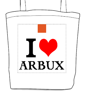
A: here we see a simple I Heart Arbux design, with the red square at the top to be replaced with one of those You Scan It QR codes to take our fellow Arbux-lovers to a website promoting (and explaining) the book.
B: Here we have a pen and ink-ish picture of Arbux walking probably toward us? He has red pants on, see, so that's what that's about. The quote is from Grand dad and the gray square there is the QR code for the advertisermenting.
And now, my great, beloved (and alarmingly patient) public:
WHAT SAY YOU?


3 comments:
I probably would go with graphic A to keep it interesting and simple. People will be like Arbux? What's that all about???
Also less to take in because we are lazy people...yay
What, no dragons? Why is there no dragon option!? Hm, otherwise I prefer "B"...it's all like "what is that large man doing there in his red pants?".
Arbux, I'm hoping, will be a character that people love and end up wanting to save. I'll know soon enough!
Post a Comment